year 2026

Key contribution
UX/UI
RESEARCH & DISCOVERY
INFORMATION ARCHITECTURE
404 Mini-Game
AI-ASSISTED DESIGN & DEV
DESIGN & CONTENT STRATEGY
Responsive Web
Results
Architecture Consolidation
From Travel Catalogue to B2B Conversion Engine
WinkItaly is a boutique Destination Management Company (DMC) connecting U.S. luxury travel advisors with curated Italian journeys. The old site had one core problem, it spoke to travelers, but travelers don't book WinkItaly, advisors do. The brief that came in was narrower, move away from an info-heavy, old-school layout toward something as elevated as Cheval Blanc. Once I saw the contact form doubling as a spam magnet, I pushed the scope further, bringing research and lead-qualification into the brief alongside the visual redesign. I led the end-to-end redesign, stakeholder research, persona mapping, architecture consolidation, and a live build shipped through an AI-augmented workflow, briefing a developer on select structural components, in six weeks.
Tools used








Spam, Ambiguity, and the Missing "Luxury" Feel
Auditing the site surfaced both structural and aesthetic flaws. Visually, it read like a generic travel catalog rather than an aspirational luxury brand. Functionally, "Why WinkItaly," "About Us," and "Our Approach" pages all made the same trust argument, diluting the message and confusing the journey. Most critically, the contact form had no B2B fields and had become a spam magnet rather than a lead source. This wasn't a UI refresh, the digital presence was actively underselling a white-glove physical service, and the gap between brand reality and brand perception needed closing. Left unaddressed, that gap wasn't just a branding issue, it was costing the team real hours triaging inquiries that were never going to become clients.

The Advisor Who Buys, the Client He Serves
Running the research phase solo, I conducted stakeholder interviews with 2 key decision-makers and ran a structured survey among 7 high-end U.S. luxury travel advisors. Together, they revealed two personas: James David Smith, an advisor whose real product is his own reputation, and Kelly McChesney, his client, who delegates full complexity to someone she trusts. The data was clear, structured DMC support scored 5/5, White Label's brand impact scored 4.71/5, and "Local Expertise" outranked every other confidence driver. The signal, B2B advisors buy operational trust before they buy aesthetics, this was no longer a travel brochure to design, it was a B2B service tool to engineer. Alongside the survey, I benchmarked WinkItaly against other luxury hospitality sites.
Survey insights


STRATEGIC INSIGHT
//
Insuring Against Reputational Risk
One insight changed the whole plan, advisors don't buy itineraries. They buy insurance against looking bad in front of their own client. WinkItaly's job isn't to prove Italy is beautiful, every competitor already says that. Its job is to prove it won't let James down at 11pm on a Saturday, when a driver doesn't show up in Positano. That changed what came first on every page, structure before guarantees, method before adjectives, and a contact form that qualifies leads instead of just collecting messages. Every design choice after that had one job, make WinkItaly feel reliable, not just beautiful. Once advisors trust the operations, they trust the itinerary too.
SOLUTION & STAKEHOLDER MANAGEMENT
//
Rebuilding the Sitemap Around the Advisor's Journey
Clients naturally fear that cutting pages or adding form fields will cost lead volume. By involving stakeholders in continuous, collaborative reviews from day one, I reframed the conversation from "losing pages" to "reducing redundancy." We collapsed eight overlapping pages into five, each answering one question in the exact order an advisor asks it: Home answers why WinkItaly, About & Approach earns trust with method instead of adjectives, Services becomes a scannable operational checklist, Travel Inspirations merges destinations and itineraries into one browsable hub, and Contacts moves from a spam trap to a high-intent B2B qualification form requiring consortium details.


Home
about & approach
services
travel inspirations
contacts
MEnu
VISUAL DESIGN STRUCTURE
//
Translating a "Premium Italian DMC" into a B2B Interface
To read as trustworthy to an American B2B audience, the UI relies on strict editorial typography, generous negative space, and a muted, refined palette that avoids generic travel clichés. Elegant, curated photography balances against clean, scannable text layouts to reduce cognitive load, an interface built for reading and confident decision-making, proving the ground operations are as meticulously structured as the digital presentation.
DESIGN SYSTEM & ACCESSIBILITY
//
Engineering a Scalable, WCAG-Compliant Token Architecture
Translating a luxury brand into a functional product needed a structural foundation, not just a style. I built a full design token system in Figma: color primitives, semantic typography scales, and systematic spacing constraints with a WCAG contrast checker built directly into the color matrix to meet AA and AAA accessibility standards. The result stayed visually consistent, accessible, and ready for rapid AI component generation, a foundation built to extend cleanly if WinkItaly adds pages or campaigns later.


customised pattern
Travel inspiration page - Mount Etna & Taormina
Travel inspiration page - amalfi coast & capri
Evoking "La Dolce Vita" as a Sensory Catalyst
Operational trust earns the click, but selling luxury travel still needs a visceral spark. I designed a sensory micro-experience across key pages, evocative audio-visual cues that let a visitor briefly step into the Italian atmosphere. These moments don't just speak to an advisor's analytical mind; they let them feel the romantic, high-end reality they're selling to their own clients.


Pushing Technical Constraints with AI
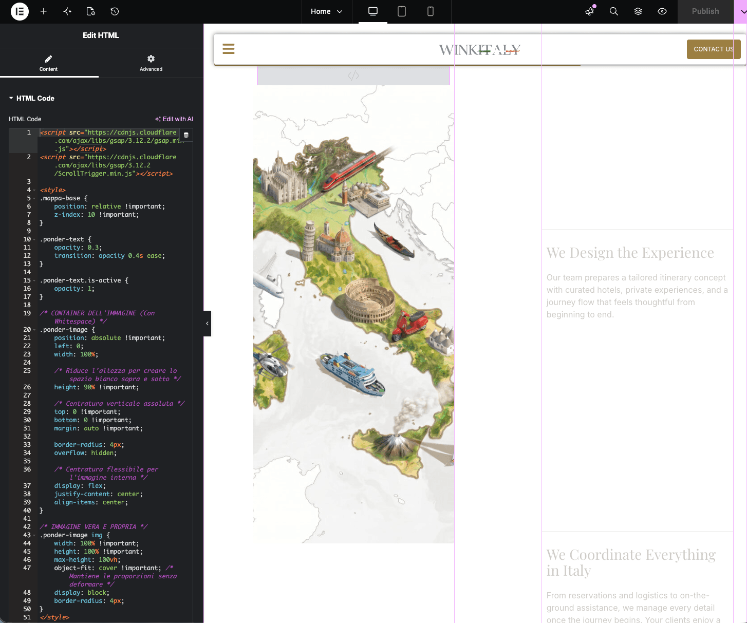
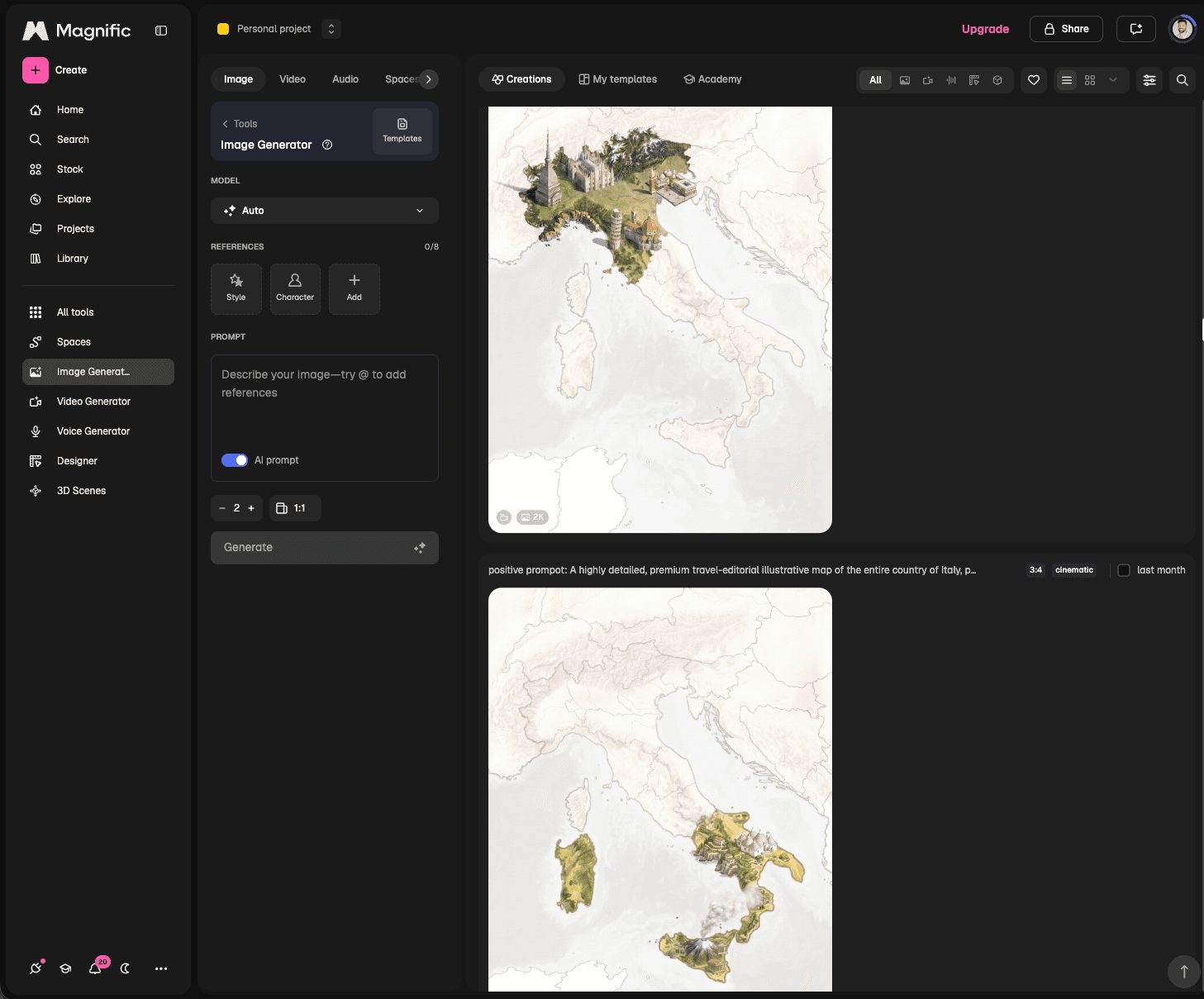
This project ran an AI-native pipeline under strict human oversight. I used Claude to synthesize raw Typeform data into actionable personas, reviewing and refining every output to map the information architecture accurately. To push past Elementor's native constraints, I iteratively prompted Gemini to generate custom HTML/JS widgets, then hand-tweaked the code for bespoke, high-end interactions. And while the core site leans on authentic professional photography for human connection, I used Magnific AI to generate specific 3D-style assets, most notably a bespoke isometric map of Italy, built to match the muted luxury palette exactly.
examples of gen ai - images and code





Turning a Dead End into Brand Equity
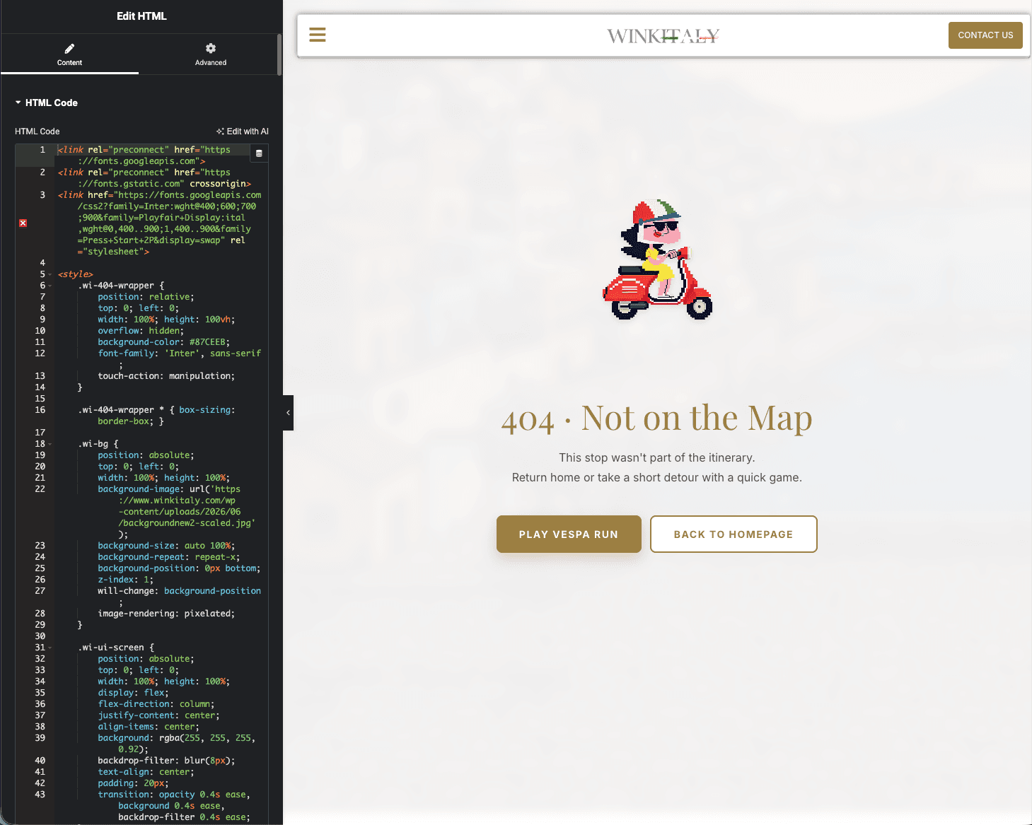
A 404 is normally friction. I engineered a Chrome Dino-style pixel-art mini-game to replace it instead, a Vespa driver dodging Italian cultural icons (Venetian glass, regional food, wine) against a Southern Italy backdrop, with a toggleable Tarantella soundtrack and combo-jump triggers shouting "GRANDE!" I built it as an unprompted easter egg to surprise stakeholders during a review, proof that a moment of playful, unexpected delight turns a technical failure into long-term brand recall.


404 - Vespa game
Driving B2B Lead Qualification and Market Validation
The rebuild replaced a generic, spam-prone site with a structured B2B engine. Collapsing eight redundant pages into five cut the page count by 38%, removing every source of duplicate messaging without losing coverage. Since launch on July 1, the rebuilt contact form has logged 9 submissions, every one a qualified inquiry from a travel advisor seeking partnership, the exact audience the redesign targeted. Where the old form was a spam magnet, the new one is a filter. Early signal, but the mechanism is doing exactly what it was engineered to do.
Post-launch, I shared the live site with all 7 surveyed advisors and a wider circle of travel professionals for direct feedback. Two things came up unprompted every time: the clean, intuitive content order and the premium interactions. The client heard the same thing from their own network, consistent praise, and a first impression unlike anything else in the category.

Human Strategy, AI-Assisted Execution
The real unlock wasn't the luxury layout, it was the research-backed decision to consolidate the architecture and prioritize B2B qualification before anything else. AI acted as an amplifier throughout, not a replacement. The personas, the IA, the stakeholder alignment, and the art direction were all human judgment calls. Marrying iteratively AI-generated custom code with Elementor took careful orchestration to keep the site feeling premium without sacrificing load times. That's the leverage I get from AI, more time for rigorous research, client alignment, and business strategy, less time lost to manual execution.
ask
Nick AI