year 2019 → 2026






Tools used



The inconsistency tax And How It Hurts Users.
A UI that grows without a shared system gets expensive fast. Engineers dig through a Figma file with 47 versions of "primary blue" looking for the right hex code. Designers rebuild a card component from scratch because nobody told them one already exists. Accessibility becomes a QA checkbox at the end of the sprint instead of a decision made at the start.
Users feel all of it, even when they can't name it. A button that behaves one way on page 3 and another on page 1 chips away at trust before anyone's spoken to support. A design system doesn't just fix a workflow problem. It removes that uncertainty from the experience entirely.
Token-First Architecture.
I start with tokens, not components. The component is the output, the token is the decision. Every system I build uses a three-tier model that keeps structure and visual language completely separate.
Global Tokens
The raw values, #1A1A2E, 8px, Inter 500. These define core brand decisions and are never applied directly to components.
Semantic Tokens
Contextual assignments like color-bg-primary or spacing-container. This layer manages multi-brand themes, dark mode, and responsive scaling effortlessly.
Component Tokens
Specific mapping like button-bg-primary. These align 1:1 with the production codebase.
The System's API
Handing over a Figma file is not a handoff. Anyone can share a link. What teams actually need is documentation that tells them the why and the when, not just the what. Without it, the system fractures the moment a new designer joins or a new component is needed.
Usage Guidelines
Clear rules for how components can be combined, stretched, or stacked, with explicit examples of what breaks when you ignore them. The do's matter. The don'ts matter more.
Accessibility Specs
WCAG compliance isn't a checklist at the end of the sprint. Focus rings, ARIA labels, keyboard navigation flows, screen reader readouts, all defined at the component level, baked in from the start.
Developer Handoff
Figma properties mapped 1:1 with code repositories. Variable names, spacing values, interaction states, mathematically identical on both sides. Engineers should be able to implement a component without sending a single Slack message.

From Zero to System. Design Advocacy Under Deadline.
use case Result
Survey insights


What Happens When You Give an AI Your Design Tokens.
use case Result
Winkitaly is smaller in scope than ESA or TomTom, but it turned into the most interesting experiment in how I actually work. No existing system, no handover docs, no brand guidelines to build from. I built the entire thing from the token foundation up: colour palette, spacing scale, typography, border radius, shadows, all defined in Figma Variables before a single component got drawn.
Then I changed how I worked. Instead of going straight to Figma to explore components, I fed the token structure into Claude, not as a chatbot, but as a system-aware assistant. I gave it the brand constraints, the token values, what each component needed to do. It handed back a structural scaffold: component logic, token mappings, interaction states. I took that into Figma and did the actual visual craft by hand from there.
Every component was token-compliant from the first pass. Not retrofitted, not checked against a list afterward, correct from the moment it existed. That didn't make me faster by cutting corners, it made me faster by skipping the blank-canvas phase, which is the part of component design that eats the most time for the least payoff. The decisions that needed real judgment still got real judgment. It was the structural groundwork that got compressed from days to seconds.


customised pattern

Expanding a production system.
use case Result
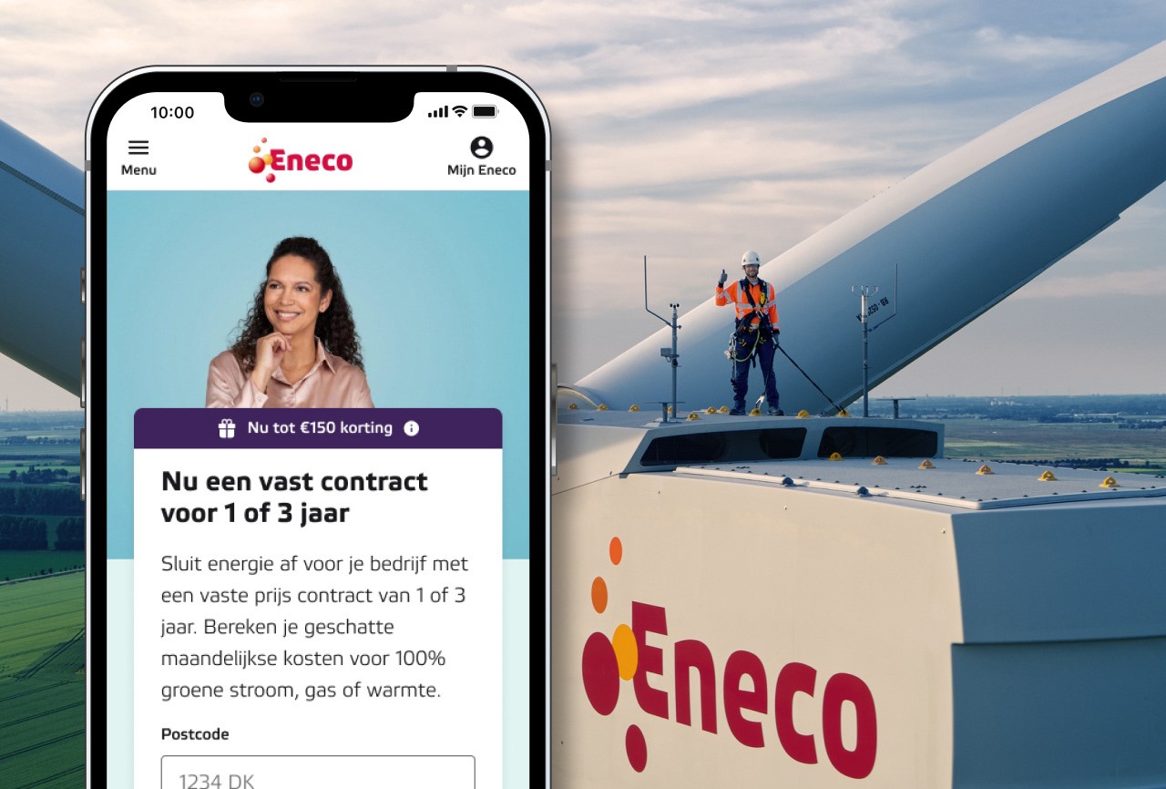
Eneco's design system was already live and already trusted by the teams using it. My job wasn't to introduce a new approach, it was to earn a place inside one that already worked. Working alongside the existing design team, I contributed to expanding the component library and its documentation. Every component I proposed started from a real problem, a user need nobody had addressed yet, or a business goal that called for a new pattern. This wasn't about adding things to round out a library. It was about solving something specific, in a way the whole team could reuse.
Components had to be editable and usable across platforms, available to any designer in the system, not built for one flow or one product. Getting something into the library took more than building it well. It took a case. Designers and developers met weekly to walk through proposed additions, edits, and deprecations, the reasoning behind them, what they meant for governance, how they'd hold up across contexts. Nothing moved forward without that alignment. Approval was earned, never assumed.


Systems as the Engine for Strategic Design.
We've always said design systems reduce friction between design and engineering. That's still true. But it's not the most interesting thing they do anymore.
A token-based design system is structured data. It's predictable, semantic, and machine-readable. And that matters now in a way it didn't five years ago, because generative AI tools can't produce brand-compliant, accessible UI from messy, hardcoded files. They can't interpret what a designer meant by the purple that's slightly different from last sprint's purple. But they can work with a semantic token called color-interactive-primary. They can understand a spacing scale with named steps. They can generate compliant components from a system built to be understood.
The work I did on Winkitaly was a small version of this. What I fed into Claude wasn't a mood board, it was a structured token architecture. The output was useful precisely because the input was precise. Design systems built right aren't just tools for today's teams. They're the infrastructure for how AI-assisted design will work. The designers who understand that will spend less time on execution and more time on the decisions that actually require a human.


ask
Nick AI